Ozark is a portfolio theme designed for all types of creative websites. It was built based in the latest trends in design style and typography choices.
Address
63739 Street B:9 City, Country
Phone
1-900-333-333
ozark@gradastudio.com
Century of Design
The 20th century has been unique in the history of art and design, uniting creative imaginations with high tech and mass production methods. The result has been well designed products available to an unprecedented number of people. Many of these objects have found their way into the world’s finest museums, but even more beneficial has been their presence and common use in households around the world.
Event:
Graphic Design
Timeframe:
Fall 2021
Project Type:
Print Design
Tools:
Adobe Photoshop, Adobe InDesign
Objective
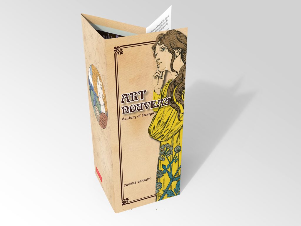
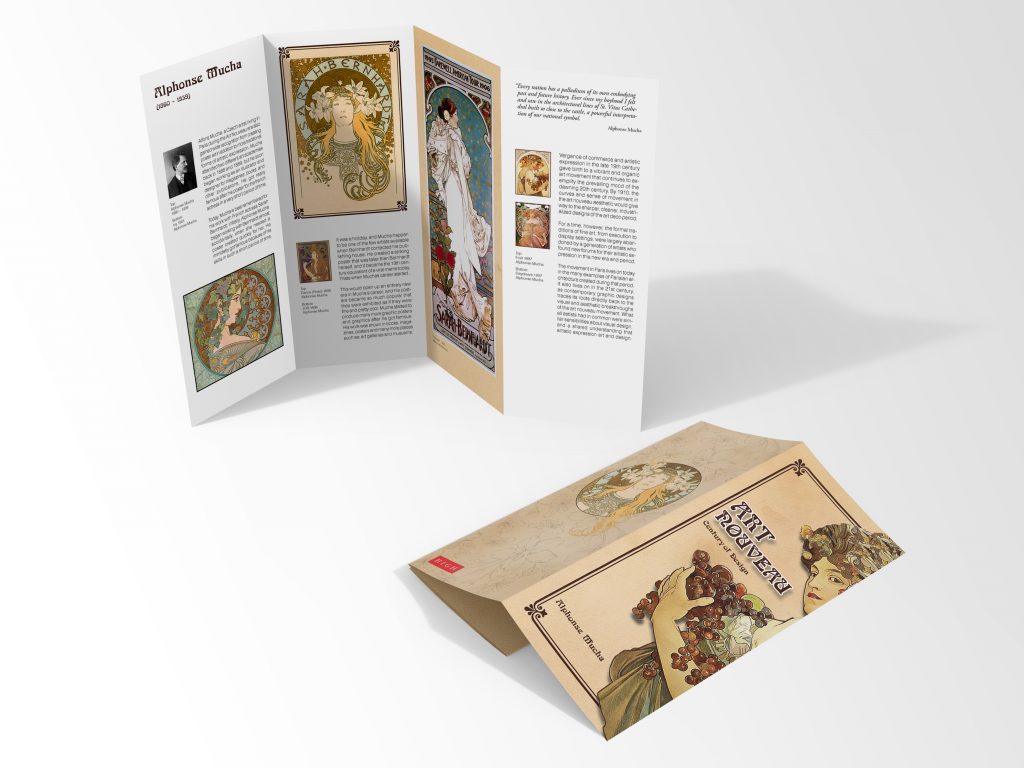
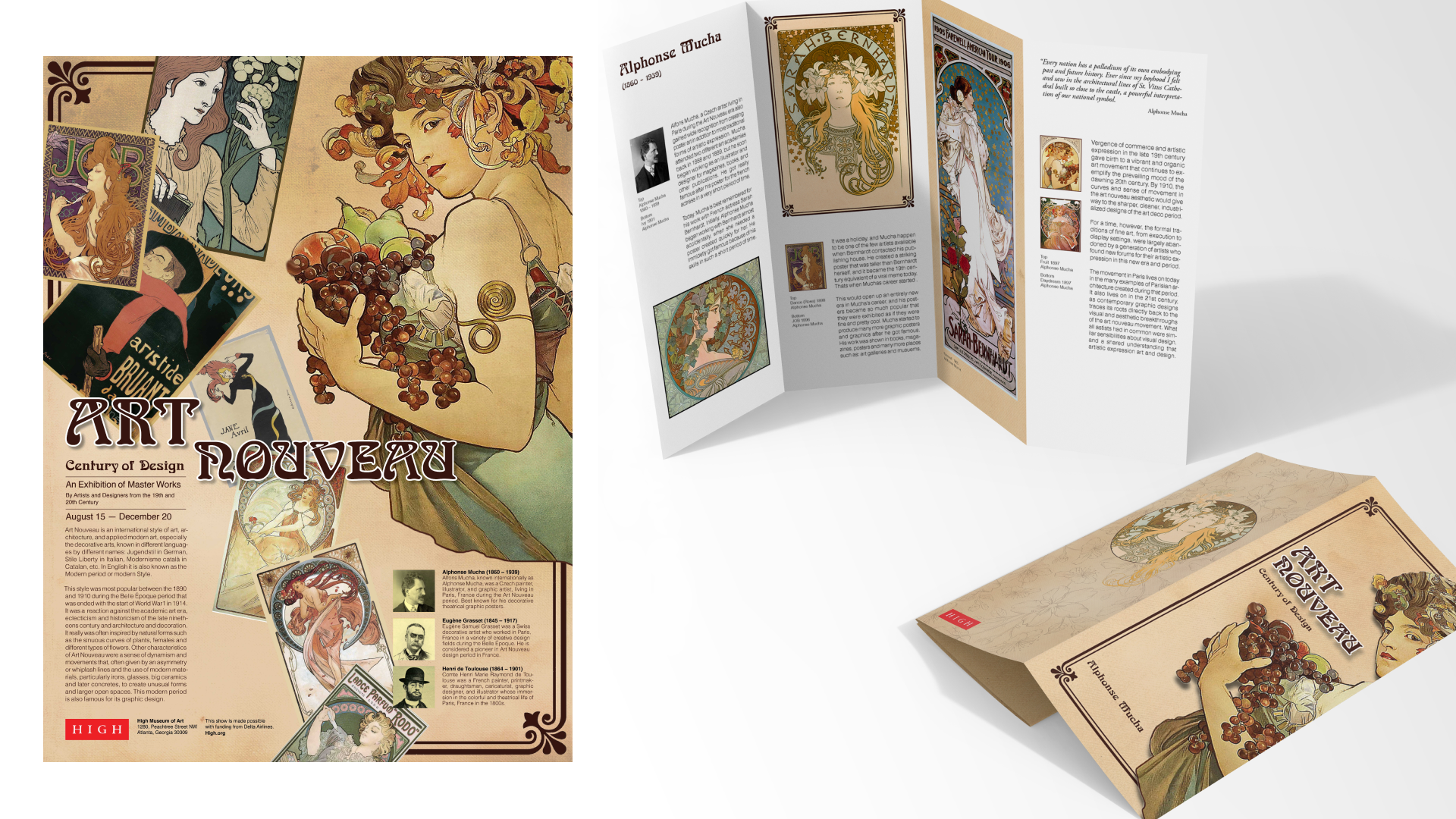
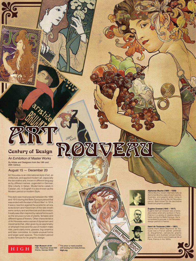
A promotional poster and brochures highlighting the work and individuals in Art Nouveau. The poster and brochure will be used in promotions and will be mailed to members to announce the A Century of Design Show which is held at the high museum of Atlanta, and online every year.
Creative Process
-
Research
Researched the Art Nouveau and its famous designers.
-
Thumbnails
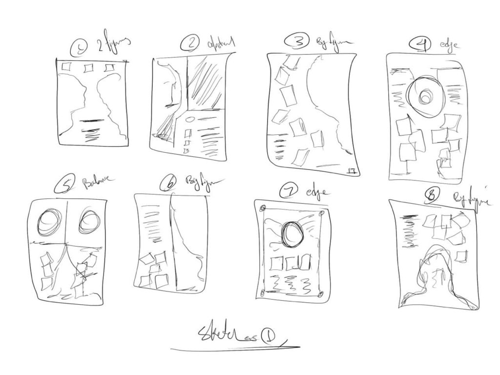
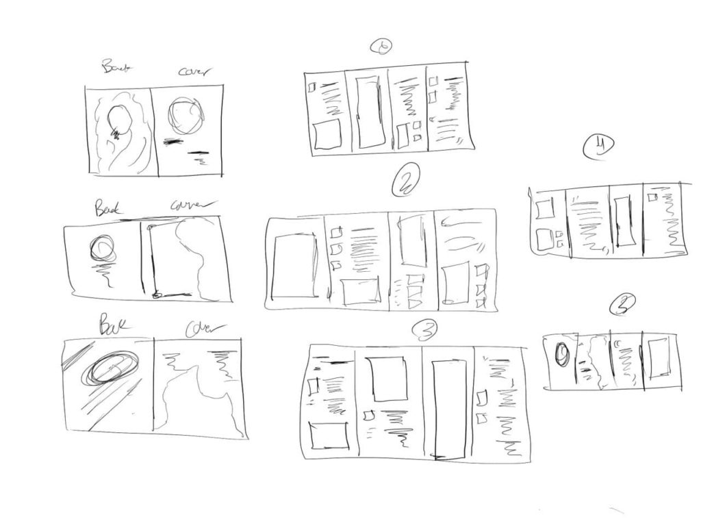
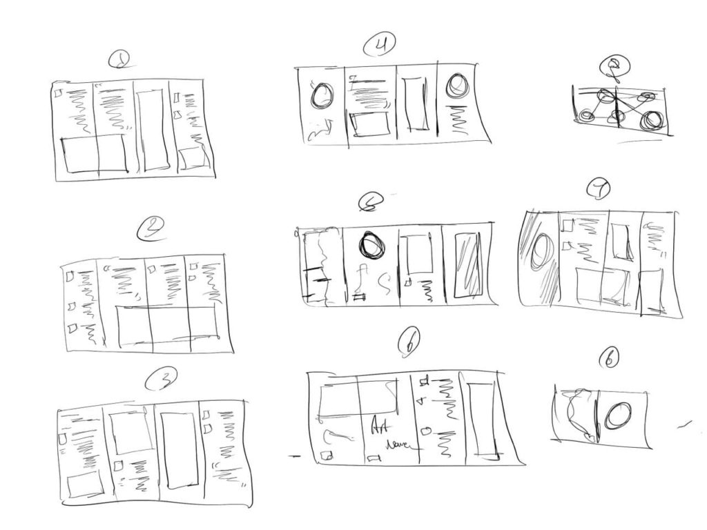
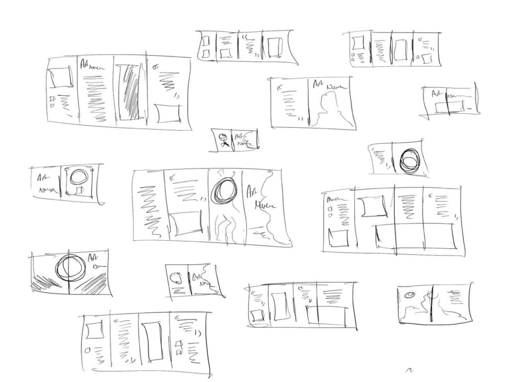
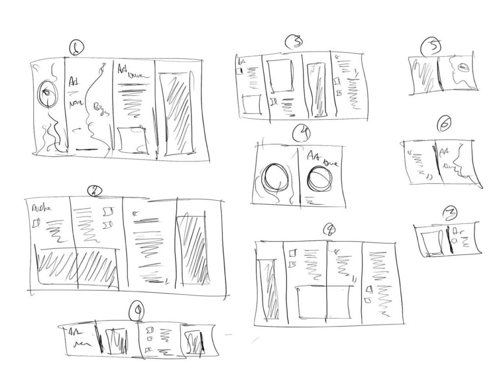
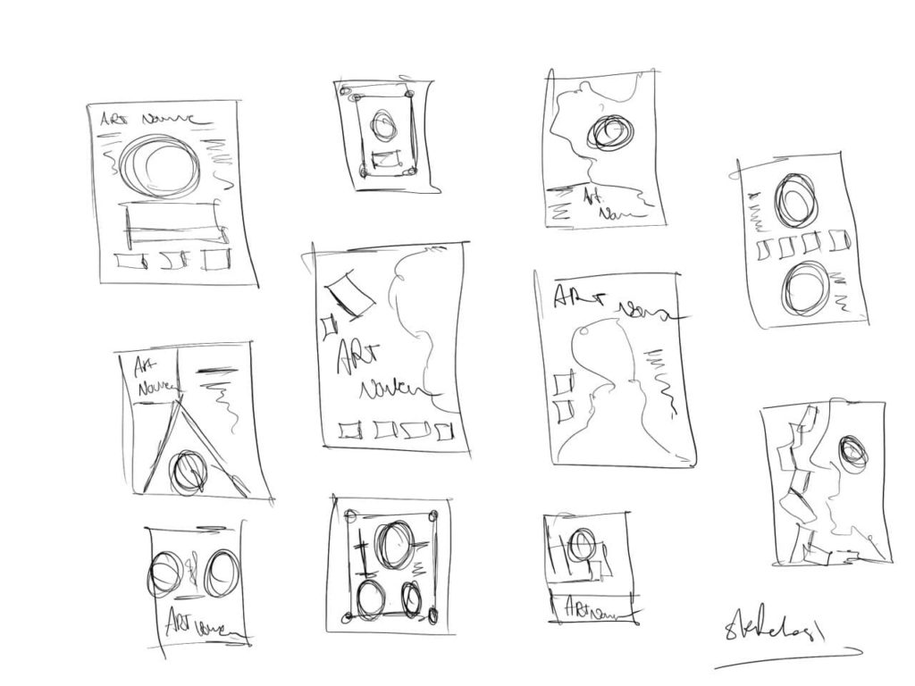
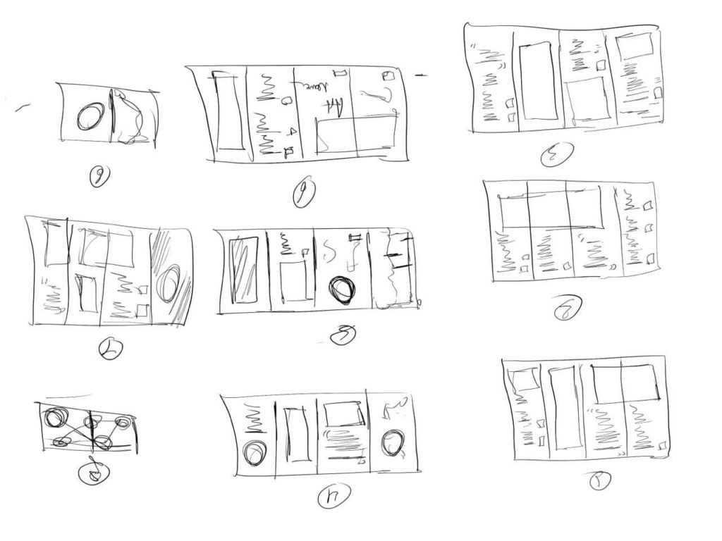
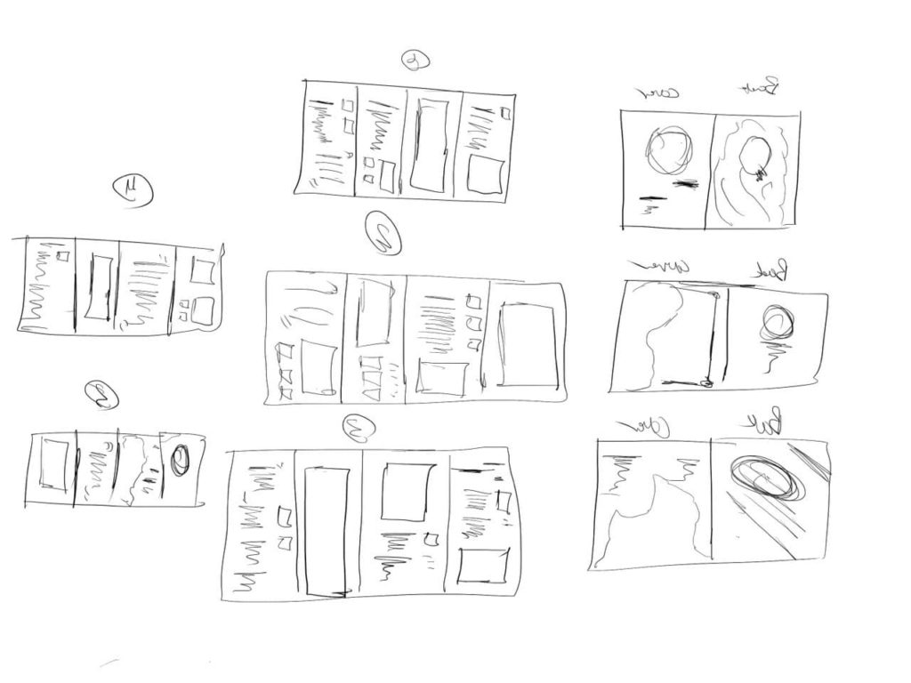
4 rounds of thumbnails for both the poster and the brochures.
-
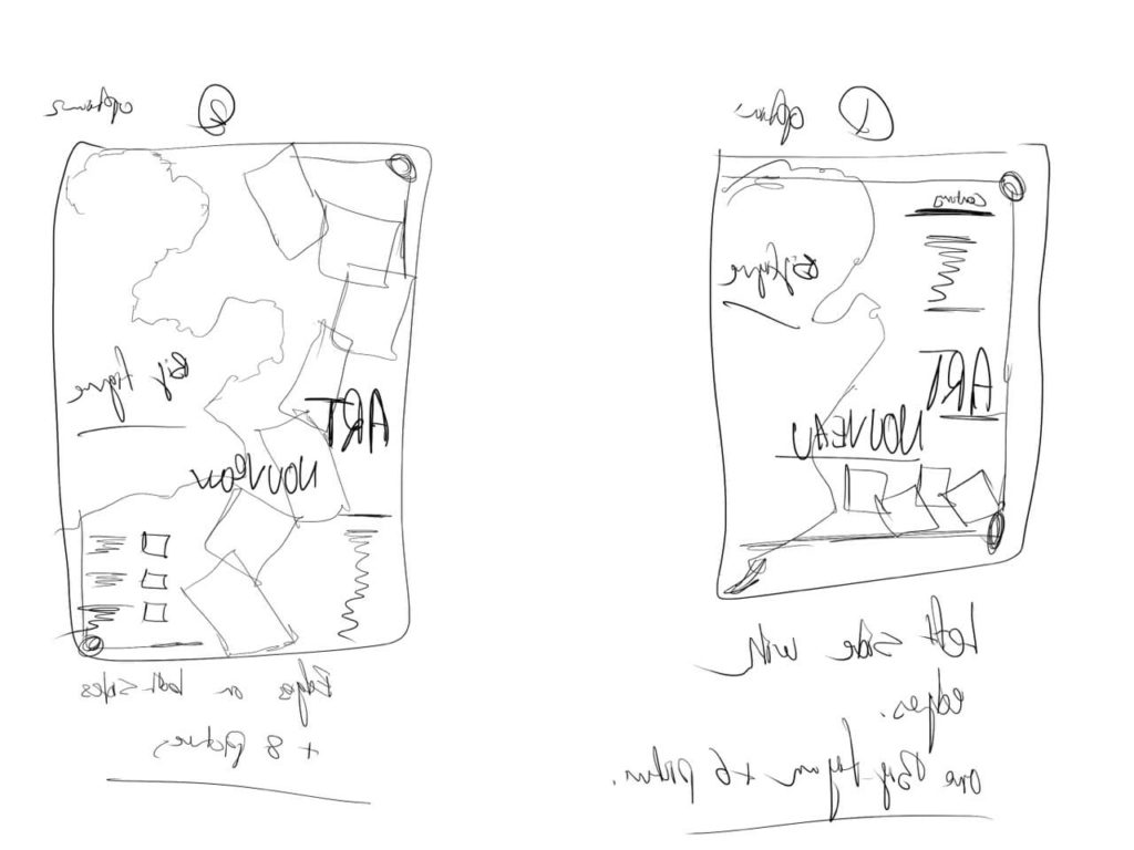
Poster Sketches
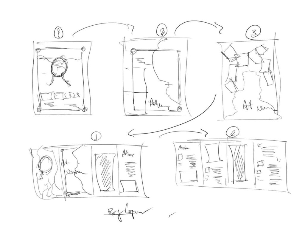
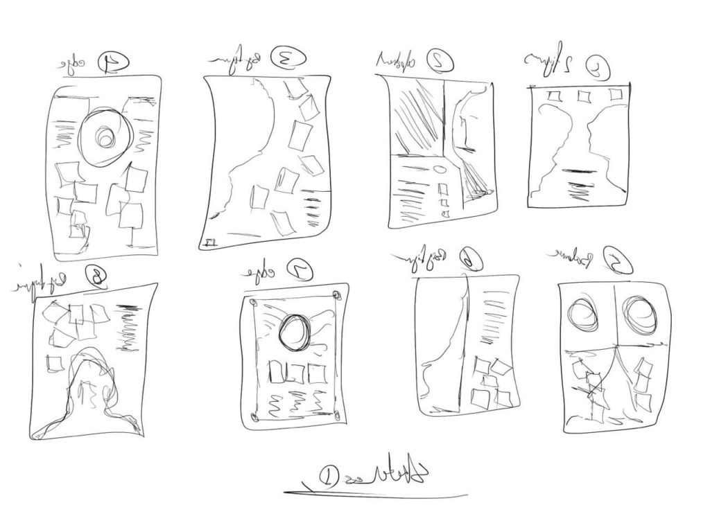
4 rounds of poster sketches.
-
Final
Final poster and 3 brochures.
Inspiration & Research
By the mid-19th century, the art world had become completely formalized and structured. Western art, in particular, had become a technical process that required a certain set of Artistic standards that were as much mathematical as they were artistic. In order to be taken seriously, artists had to attend one of the well-known art academies and undergo a formal Course of instruction in the arts. Art students were expected to learn about the basics of line, shape, form, light, space, texture and color. In painting, especially, representations of people and places were built upon mathematical sketches that focused on converging lines on the horizon and other standards. This does not mean there were not many talented artists who followed these traditions, just that the conventions of what constituted art had become fairly narrow and aesthetically safe. This approach to art would soon be challenged and defied as the economic, social, and political forces of the industrial revolution began to change the world. These changes would also transform the definition of art and change the relationship that individual members of society had with art. The art scene in Paris at the turn of the 20th century represented the zenith of this global movement, which became known as Art Nouveau.
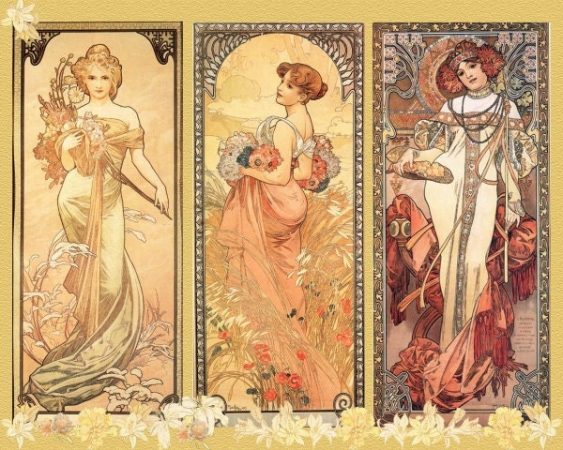
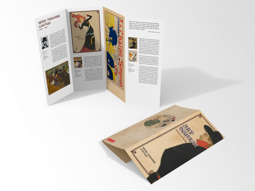
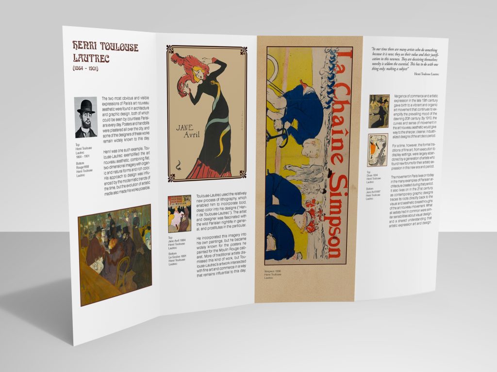
The two most obvious and visible expressions of Paris’s art nouveau aesthetic were found in architecture and graphic design, both of which could be seen by countless Parisians every day. Posters and handbills were plastered all over the city, and some of the designers of these works remain widely known to this day. Henri de Toulouse-Lautrec was one such example. Toulouse-Lautrec exemplified the art nouveau aesthetic, combining flat, two-dimensional imagery with organic and natural forms and rich color. His approach to design was influenced by the modernistic trends of the time, but the evolution of artistic media also made his works possible. Toulouse-Lautrec used the relatively new process of lithography, which enabled him to incorporate bold, deep color into his designs (“Henri de Toulouse-Lautrec”). The artist and designer was fascinated with the wild Parisian nightlife in general, and prostitutes in particular (“Henri de Toulouse-Lautrec”). He incorporated this imagery into his own paintings, but he became widely known for the posters he painted for the Moulin Rouge cabaret. More traditional artists dismissed this kind of work (“Henri de Toulouse-Lautrec”), but Toulouse-Lautrec’s artwork intersected with fine art and commerce in a way that remains influential to this day.
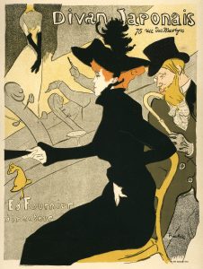
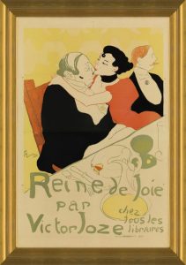
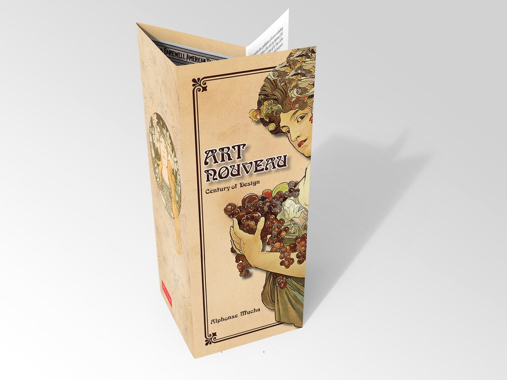
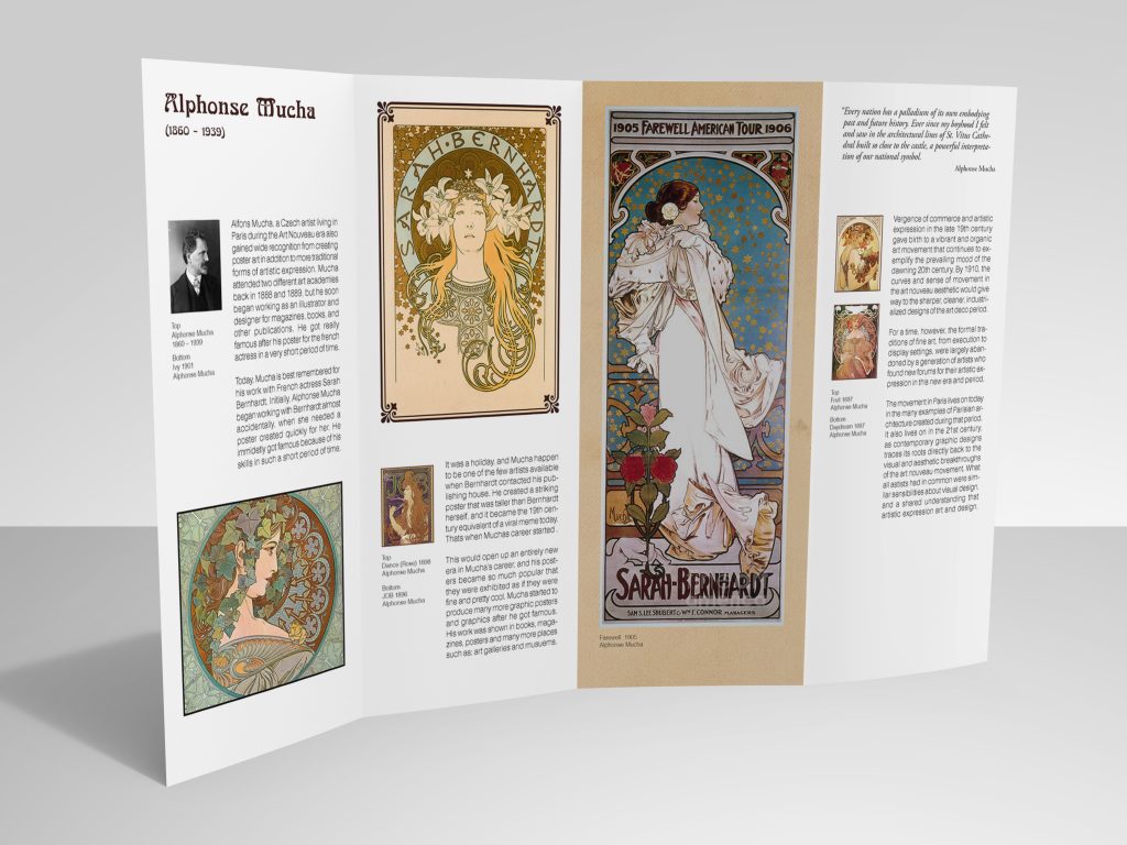
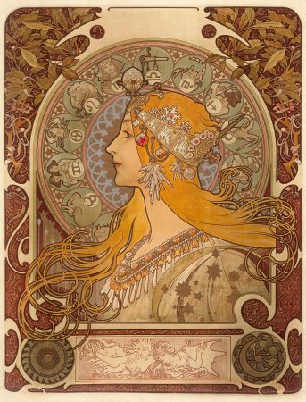
Alphonse Mucha, a Czech artist who immigrated to Paris in the late 1800s, during the Art Nouveau era also gained wide recognition from creating modern poster art in addition to more traditional forms of artistic expression (“Alphonse Mucha Biography”). Mucha attended two different art academies in 1888 and 1889, but he soon began working as an illustrator and designer for magazines, posters, books, and other publications (“Alphonse Mucha Biography”). Today, Mucha is best remembered for his work with French actress Sarah Bernhardt designed in a very short period of time. Initially, Mucha began working with Bernhardt almost accidentally, when she needed a poster created quickly for her play Gismonda. It was a holiday, and Mucha happen to be one of the few artists available when Sarah Bernhardt contacted his publishing house (“Alphonse Mucha Biography”). He created a striking poster that was taller than Bernhardt herself (“Alphonse Mucha Biography”), and it became the 19th century equivalent of a viral meme. This would open up an entirely new era in Mucha’s career, and his posters became so popular that they were exhibited as if they were fine art (“Alphonse Mucha Biography”).
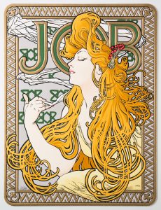
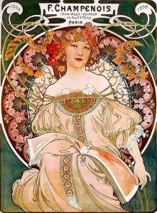
Eugène Grasset was born in Switzerland and emigrated to Paris in the 1870s. Grasset is often described as the father of Art Nouveau for his early contributions to the movement (Kern). Like Mucha, Grasset was trained in the Fine Arts, including painting and sculpture, but he found his greatest success as a poster artist and designer (Kern). Grasset exemplified the art nouveau sensibility, as he combined his love of art with the modern design aesthetic of the modern industrial age. Grasset worked on modern paintings for some of his customers, while also creating such works as a series of posters for the Librairie romantique, covers for Harper’s Bazaar, and even mosaics for a Parisian church (Kern). Grasset is also known for his work in typography, most notably a commissioned typeface known as Le Grasset (Kern). Grasset’s posters often featured beautiful women with long flowing hair, carrying flowers, surrounded in natural settings. Some of these designs are strongly reminiscent of Japanese woodblock art, but with a Westernized visual aesthetic. Like many other artists of the day, Grasset incorporated naturalism with flat imagery with distinct, bold, curving outlines.
3 rounds of sketches
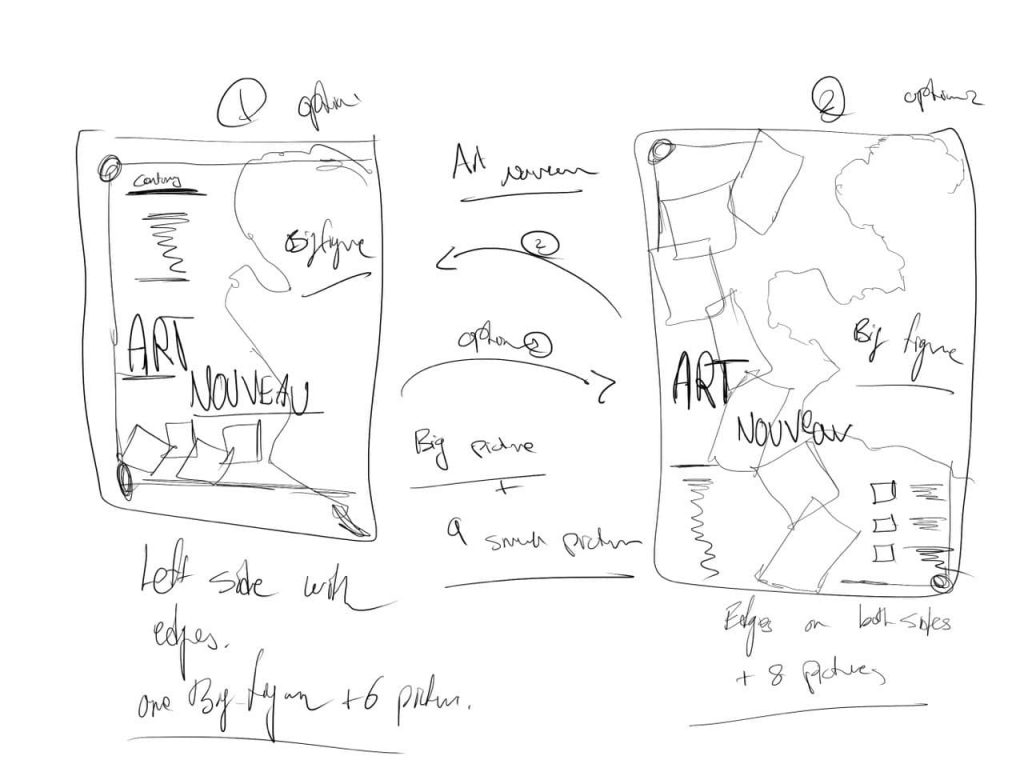
Poster Design
Brochure Design
